How to create a Venn diagram in Excel
Excel has a Venn diagram option in its SmartArt but three pretty identical circles doesn’t do it for me. When the sizes of the circles are supposed to mean something, I want them to look the part as much as I can.
So, instead of using SmartArt, I do it manually. I manually create three circles and then make them the right size. What this technique does NOT do is size the crossed parts properly but for me it’s still better than three identical circles. And, it also doesn’t account for perceptions of the size depending on the height of the circle vs the area of the circle.
Step #1: I’ve put my raw data into Excel though it is completely unnecessary. For this technique, the data table can be written solely in your brain. Using the ‘insert shape’ option, choose a circle. If you hold the ‘shift’ key down while you draw the circle, it will turn into a perfect circle.
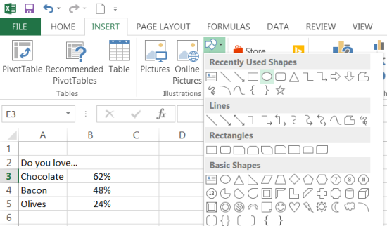
Step #2: Copy the circle 3 times for each of the 3 circles of the Venn diagram. Now, select one of the circles and then right click. A menu will appear and you can choose the size and properties option. This option let’s you choose the exact size of the circle. First, click on the ‘Lock aspect ratio’ button. Second, in the height box, type in the number that represents the size of the circle. Don’t worry if the circle is way too big or small. Just get the number right. Repeat for each of the three circles.
Step #3: Now you should have 3 circles that represent the 3 sizes in the right proportions. You can now reposition the circles so that they overlap properly. If the circles are way too big or small, then use the + or – options in the bottom right of the screen. The circles will then fit into the screen. 
Step #4: Now you can re-colour the circles or make the circle lines transparent. Just right click on the circle you want to revise and choose line and fill until you’ve got it the way you like. You can also make the rows and columns have white lines by clicking on the cross-hatched box and re-colouring them. Now you can treat the object as you might any other in Excel. Myself, I make the screen as large as possible, screen cap it, paste it into the Paint program on my machine, and then save it as a brand new jpg image. You’re done!
How to create a word cloud with word counts, Excel, and Wordle
When you’ve got the right purpose in mind, word clouds can be very useful. But when you only have a list of words and their counts, particularly when the word counts are large, how do you turn a short list of words into word cloud?
Well, let’s take an easy example and work with this list of words. Because this is an easy list, we could just re-write it into this: Cake, cake, cake, cake, cake, brownies, brownies, brownies, cookies, cookies, pie, pie, pie, tarts, tarts, tarts, tarts, tarts, tarts, tarts, tarts, tarts, squares, squares, squares, squares. That took me about 1 minute to write out.
| Cake | 5 |
| Brownies | 3 |
| Cookies | 2 |
| Pie | 3 |
| Tarts | 9 |
| Squares | 4 |
But what happens when your list looks like this? Are you really supposed to write out each word thousands of times just so they can be copied into Wordle? And what happens if there are several hundred words in your list and they all have hundreds or thousands of mentions? It could take an hour to do to accurately and, as you’ll soon find out, is a complete waste of time.
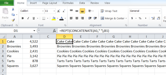
| Cake | 4522 |
| Brownies | 3492 |
| Cookies | 2431 |
| Pie | 3142 |
| Tarts | 878 |
| Squares | 3627 |
Have no fear! A quick little Excel trick is in order. Have a peek at the picture here and notice the equation. This handy little equation tells Excel to choose the word in column A and then repeat it by the number in column B. The concatenate portion inserts a space between each word which is important for Wordle to distinguish between each word.
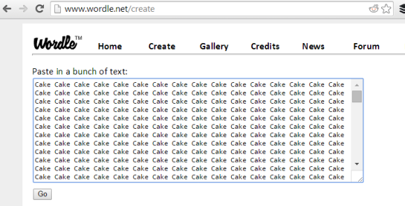
Now all you need to do is copy the contents of column D into Wordle.
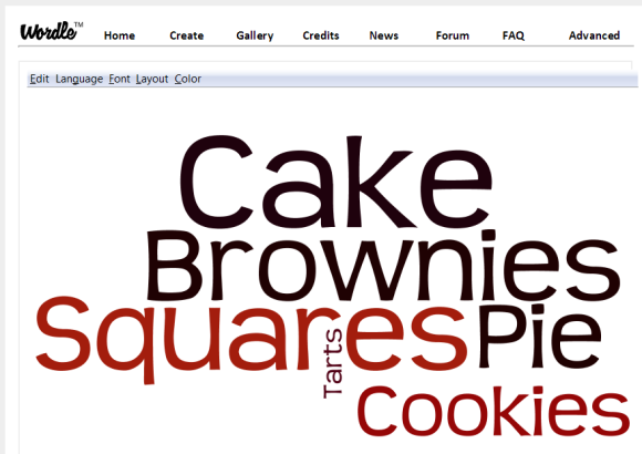
And then click on Go! Now you can try it with a really long list of words and it will just take a couple minutes. Enjoy!
Related articles
- The Bakery Review: Phipps Bakery Cafe (lovestats.wordpress.com)
- The Bakery Review: My Market Bakery (lovestats.wordpress.com)
- How to create teeny tiny barcharts in Excel #MRX (lovestats.wordpress.com)
- How to fake a two directional bar chart in Excel (lovestats.wordpress.com)
5 ways to sexy up a chart without using the 3D function #MRX
I know. It’s tempting. You want to make a splash. You want to liven up the page. And you need to do it fast. But what are you supposed to do knowing that the 3D function misrepresents data and makes you look unprofessional as a data visualizer? How can you make your chart really cool and sexy?
Have no fear, my tips are here!
1) choose a really sexy chart that best reflects the data. Line charts for changes over time, bar charts for comparisons of categories, pie charts for percentages that add to 100.
2) choose sexy colours from the primary and secondary colour wheel. Avoid fluorescent colours. Avoid using yellow on white. And keep in mind that 8% of guys are colour blind so consider a restrained use of dotted or dashed lines.
3) choose really sexy labels and titles that clearly describe and explain the contents of the chart.
4) choose sexy scales that start at zero, end just above the largest number, end have 3 or 4 cut points in between.
5) as a last resort, if you think a chart can only be sexy if it has unnecessary and extraneous components, insert several sparkly blinky unicorns and switch careers

A “How-To” Session on Modularizing a Live Survey for Mobile Optimization by Chris Neal and Roddy Knowles #FOCI14 #MRX
Live blogging from the #FOCI14 conference in Universal City. Any errors or bad jokes are my own.
A “How-To” Session on Modularizing a Live Survey for Mobile Optimization
Chris Neal, CHADWICK MARTIN BAILEY
& Roddy Knowles, RESEARCH NOW
- conducted a modularized survey for smartphone survey takers, studied hotels for personal travel and tablets for personal use, excluded tablet takers to keep the methodology clean
- people don’t want to answer a 20 minute survey on a phone but clients have projects that legitimately need 20 minutes of answers
- data balanced and weighted to census
- age was the biggest phone vs computer difference
- kept survey to 5 minutes, asked no open ended questions, minimize the word count, break grids into individual questions to avoid burden of scrolling and hitting a tiny button with a giant finger
- avoid using a brand logo even though you really want to. space is at a premium
- avoid flash on your surveys, avoid images and watermarks, avoid rich media even though it’s way cool – they don’t always work well on every phone
- data with more variability is easier to impute – continuous works great, scale variables work great, 3 ordinal groups doesn’t work so well, nominal doesn’t work so well at all
- long answer options lists are more challenging – vertical scrolling on a smartphone is difficult, affects how many options responders choose, ease of fewer clicks often wins out
- branching is not your friend. if you must branch, have the survey programmers account for the missing data ahead of time, impute all the top level variables and avoid imputing the bottom level branched variables
- Predictive mean matching works better than simply using a regression model to replace missing data
- hot decking (or data stitching which combines several people into one) replaces missing data with that from someone who looks the same, worked really well though answers to “other” or “none of the above” didn’t work as well
- hot decking works better if you have nominal data
- good to have a set of data that EVERYONE answers
- smartphone survey takers aren’t going away, we need to reach people on their own terms, we cannot force people into our terms
- we have lots of good tools and don’t need to reinvent the wheel. [i.e., write shorter surveys gosh darn it!!!]
Other Posts
How to create a loyal following like Lady Gaga by Jackie Huba #CMACX #MRX
Live blogging from the MRIA/CMA #CMACX customer experience conference in Toronto. Any errors or bad jokes are my own.
How To Create A Loyal Following Like Lady Gaga
Jackie Huba, Author, Speaker, Consultant
- Lady Gaga has only been around for 6 years but everyone knows her name

- 24 million album, 15 grammy nods, 5 grammy wins, 41 million twitter followers
- Gaga focuses on the one percent of fans who really care
- Her fans are of all ages
- If you are first in line for her concert, you get to meet Lady Gaga. People wait in line all week to be first.
- 1% can be really crazy people. It doesn’t mean they’re nutballs or crazy, they could be your best most die-hard fans. The weirdness is centered around love.
- Are there huge fans of Costco? Yes. Even though it’s just a discount warehouse. There are 1%ers everywhere.
- 1%ers can be virtual salespeople. What if you didn’t KNOW you have lots of 1%ers
- it is 5times cheaper to keep a customer than to get a new one. we spend so much time on getting customers.
- Troy Carter – it’s more important to have one million diehard customers than 54 million facebook likes
- Lead with values.

- Lady Gaga was initially popular in the LGBT crowd and she never forgot them. “Born this way” album and song were for them. People told her the song gave them strength to not end their lives. Gaga created a Born This Way foundation to promote bravery, acceptance, love to this community. She even let people hang out on the tour bus and there were counselors available if you needed them.
- Companies that lead with better do better financially
- “Method” brand of soap/cleanser. Brand started as a catalyst in a happy, healthy home revolution. Kicked off category of green cleaning and did well until the recession.
- Build community – 1%ers love to connect with other people like them. It feels weird to be weird so it’s good to connect with others like you.
- Gaga created a social network just for her fans. “Little Monsters” https://littlemonsters.com/ It translates 100 languages in real time. Gaga posts messages here just for her fans, her hair, her choreography, her weight. She interacts with them personally. NOT on facebook, NOT on twitter.
- MINI does this well. There are fan clubs around the country organized by 1%ers, not the company.
- “MINI takes the stakes” A ten day trek across new york. 300 minis might show up at events. 89 people drove the entire trek. This is what 1%ers do.
- Generate something to talk about. People can talk about things but eventually they run out of topics. Gaga has a perfume. This is a crowded field. She wanted something different – it looks black in the bottle, but it’s clear inside. She created a ten minute movie about the perfume.
- Was the fastest selling perfume after Chanel 5.
- She pushed to do something completely different.
- ALAMO drafthouse cinema always tries to stand out. provide an awesome experience for true movie fans – quote along, sing along shows. “We do not play ads. We do not allow small children. We do not allow unaccompanied minors. We do not allow late comers. If you keep talking or texting we will throw you out with no refund.” [YES!!!!!!!!!!!!!!] Remember their viral video?
- http://www.youtube.com/watch?v=1L3eeC2lJZs

Other Posts
- Peanut Labs Ask-Me-Anything with special guest Tom Ewing
- Peanut Labs Ask-Me-Anything with special guest Kristin Luck
- Behavioural Economics Can Finally Explain Human Behaviour
- The toughness of soft skills by Steven Tramposch, Heineken #CMACX #MRX
- Mix in a little India #CMACX #MRX
- How Mondelez captured the heart of Canadians during the Sochi Olympics #CMACX #MRX
- Mind, Mood, Music, and Marketing by A.K. Pradeep (Great talk!) #CMACX #MRX
How to create a great twitterstream
There are a few basic rules to creating a great Twitterstream. The most obvious ones are
- Follow people with similar interests
- Don’t follow people who only tweet marketing messages
- Don’t follow people who only tweet inspirational messages
- Don’t follow people just because they followed you first
These tips will ensure that your Twitterstream is generally interesting and relevant. But, you’ll still see lots of irrelevant and uninteresting tweets with this method as most people like to create a bit of variety by tweeting off-topic once in while. It does potentially create a more fun reading pane for those just looking for something fun to read. 
But, if you’re rushed or really need to focus, an open Twitterstream can sometimes bog you down. One of the best things you can do is create the perfect search string. For instance, here is the search string I use
The essential features are
- Choose your favorite hashtags and insert “OR” between each of them
- Choose terms you NEVER want to see. In my case, my stream is completely wiped of all things bieber and directioners. Just insert “-” before each of the dreaded words
- Choose a language. I only want to see English tweets so I type “lang:en: at the end of my search string
- Run the search and then save it
As you use the search string every day, take note of which hashtags need to be added to the list to include or exclude more tweets. Re-save your search string and then delete the old one. After a few days of adding and removing terms, you’ll end up with the perfect, highly relevant search string. Enjoy!
[To delete an old search string, run the old search string. Then the delete option will appear in the corner.]
How to create teeny tiny barcharts in Excel #MRX
Prepare to be astounded. This great little chart is perfect for those situations where you normally share an excel sheet instead of creating a ppt or word file.
First, go and download a font called Bargraph. Be sure to install it before you open up Excel.
Now follow these few steps.
- Lay out your series of numbers in separate columns as you normally would. Monthly sales data, weekly counts, whatever it may be.
- Copy the concatenate equation that you see in the image below to turn the 12 separate numbers into 1 single number in column N.
- Change the font of column N to bargraph, as you can see in the font choice menu.
- Done!

You may find that the numbers you want to use aren’t single digits as is required to create this chart. All you need to do is transform your numbers into single digits. It may be as simple as dividing each number by 600 as I have done below. You could also try using log or other traditional functions. Be sure to round to zero decimal places or truncate the number so that there are no decimal places. Remember, you can only use the numbers between 0 and 9. And…. you’re done!
Related articles
- How to fake a two directional bar chart in Excel (lovestats.wordpress.com)
- How to create an Excel bar and line chart in one (lovestats.wordpress.com)
How to fake a two directional bar chart in Excel
Excel has lots of charting options. Line charts, bar charts, scatter plots, pie charts and oh, so much more. But it doesn’t have this chart.
This is a nice chart for showing two values for many different variables. It’s easy to read with the labels listed vertically and it fills a page nicely without being overwhelming.
Here are the tricks of the trade. You can see everything that I’ve done in the image here so it’s easy to follow along.

First, put together the three columns of data – the labels, the first score, the second score. Second, copy out the equation that you see in the Excel menu bar
=REPT(“g”,D5*2)
REPT: Excel will repeat a value a certain number of times
“g”: The value Excel is going to repeat. Notice that the font I’m using in that particular cell is webdings. You might have to use a different font to generate the same result but you’re looking for any character in any font that is a really wide fat box.
D5*2: This is how many times Excel is going to repeat the value. In the case of the highlighted cell, Excel is going to duplicate the g value 4.4 times 2. If you find your bar is too long, instead of multiplying by 2, trying dividing by 2.
Now, align right the first column and align left the second column. To remind your reader of what’s going on, colour in green the column that reflects the good thing and colour in red the column that reflects the bad thing. Well, now that I look at it, perhaps the yum column ought to be in green!
At this point, you can either copy paste the cells directly into powerpoint or word, or create a screencapped image and paste it anywhere. Enjoy!
How to create an Excel bar and line chart in one
I have a habit of creating charts in Excel that include both a bar chart and line chart together. They mystify people as there is no option in Excel do do such a thing. Oh, but indeed there is. Follow along my dear friends and I’ll show you.
First of all, create a bar chart as you normally would. A column for labels, a column for the first set of numbers, and a column for the second set of numbers.
Now the tricky part.
Click inside the chart on one set of data. You’ll see here that I clicked on the blue bars. All the blue bars have the little circles on the corners to indicate that I have indeed selected all of them.
 Now, in the top excel menu, click the option that let’s you choose the design of your charts. In this case, it’s simply called design.
At the very left of my menu, there’s now an option that says change chart type. Click!
This opens up all the chart types and I’m going to click on the line chart. Now click OK.
And you’re done! You should now have a chart with both lines and bars in it.
 This same process will work for any number of bars or lines. You could create a chart with one set of bars and 14 lines, or 3 sets of bars and 1 line. In the end, all that matters is that the chart is readable and doesn’t misrepresent the results.
Enjoy!
Other posts
How to Create Actionable Results out of Nothing #MRX

Actionability. One of the best buzzwords we have at our disposable. So many research projects are lacking in so much actionability, and while there may not be an app for that,there certainly is a cure for that. Here’s the two step cure:
- Start every research project with a specific research objective. Not “see what you can find” but rather “which colour do consumers prefer.”
- Use your creative brain. Every single answer to a specific research objective is screaming an actionable outcome at you. If your data says consumers hate the colour black – Don’t use black! If your data says something is too salty – Put less salt!
In so many cases, complaints about the lack of actionable results simply come back to the failure to apply a creative brain to data. So get the creative juices flowing and you’ll see, yes, it IS that easy.
Related articles
- No Virginia, there are no insights #MRX (lovestats.wordpress.com)
- The Failure of the Story Paradigm #MRX (lovestats.wordpress.com)
- Y U No Have Research Objective? #MRX (lovestats.wordpress.com)