Voxpopme 8: Two key tips or tricks for communicating insights that resonate with the C-Suite and drive real results
Along with a group of market rese![]() archers from around the world, I was asked to participate in Voxpopme Perspectives – an initiative wherein insights industry experts share ideas about a variety of topics via video. You can read more about it here or watch the videos here. Viewers can then reach out over Twitter or upload their own video response. I’m more of a writer so you’ll catch me blogging rather than vlogging. 🙂
archers from around the world, I was asked to participate in Voxpopme Perspectives – an initiative wherein insights industry experts share ideas about a variety of topics via video. You can read more about it here or watch the videos here. Viewers can then reach out over Twitter or upload their own video response. I’m more of a writer so you’ll catch me blogging rather than vlogging. 🙂
Episode 8: Share two key tips or tricks you have for communicating insights that resonate with the C-Suite and drive real results.
Alrighty, tip number one: Sample Sizes.
The reasons for choosing sample sizes are a foreign concept to many people, leaders included. Many people depend on you to provide helpful guidance when it comes understanding what an appropriate sample size is, the drawbacks of those sizes, and how results can be interpreted given those choices. One tip I’ve used is to give them specific examples of what might and might not be statistically significant when the results do come through. For instance, rather than sharing the margin of error around a specific sample size, instead I’ll say something like:
With this sample size, a result of 30% would be statistically different from 37% but statistically the same as 36%. Are you prepared to choose a winning concept that is preferred by 30% of people rather than by 36% of people?
Tip number two: actionability.
As someone who loves raw data, cleaned data, charted data, graphed data, and tabled data, sometimes it’s hard to take the next step and make the data useable and actionable. But business leaders don’t always care about individual data points. They may not even be concerned with summaries of the results. What they really want is your informed opinion about what the data actually mean, and the appropriate options that should be considered as a result of the data. So, beyond reporting that 30% of people like a certain thing, use your understanding of the rest of the results to indicate why they like a certain thing, why they might not like it, the implications of moving forward (or not) with that thing, and how that choice might affect other products on the market already. Take the data as far forward as you possibly can in order to give them fodder to spark further ideas.
Bonus tip!
Know your own weaknesses. I know that data visualization is not my strength. When I need data to be visualized well so that it is understandable by everyone, from junior to senior and expert to newbie, my only option is to find an expert. And here’s an example of how an expert would illustrate missing data. I would have never thought to do it like but look at how effective it is. It’s worth the extra cost.
http://www.thirdway.org/infographic/the-absurd-way-we-report-higher-ed-data
 <<<<
<<<<
gt;<<
p>
Voxpopme 7: How will automation impact the industry, and you personally, over the next twelve months?
Along with a group of market rese![]() archers from around the world, I was asked to participate in Voxpopme Perspectives – an initiative wherein insights industry experts share ideas about a variety of topics via video. You can read more about it here or watch the videos here. Viewers can then reach out over Twitter or upload their own video response. I’m more of a writer so you’ll catch me blogging rather than vlogging. 🙂
archers from around the world, I was asked to participate in Voxpopme Perspectives – an initiative wherein insights industry experts share ideas about a variety of topics via video. You can read more about it here or watch the videos here. Viewers can then reach out over Twitter or upload their own video response. I’m more of a writer so you’ll catch me blogging rather than vlogging. 🙂
Episode 7: How will automation impact the industry, and you personally, over the next twelve months?
I’m not concerned with the next 12 months whatsoever. If we aren’t planning for the next five and ten years, we’re going to be in a lot of trouble. With that in mind, I’d like to consider how automation and artificial intelligence will impact me over that time frame.
The reality is that my job will change a lot. No longer will I receive a dataset, clean out poor quality data, run statistics, write a report, and prepare a presentation. Every aspect of that will be handled automatically and with artificial intelligence. I will receive a report at my desk that is perfectly written, with the perfect charts, and perfectly aligned to my clients’ needs.
So why will I still be there? I’ll be the person who points out the illogical outcomes of the data. How errors enter during the data collection process via human cognitive biases. I’ll be the person who interprets the data in an odd way that wasn’t predicted by the data but is still a plausible outcome. I’ll help clients read between the lines and use the results wisely rather than by the book – or rather, by the AI.
So how will automation and artificial intelligence impact our industry? If your business sells repetitive tasks, from survey programming to data cleaning to statistics to chart preparation and report writing, you’d better have a long term plan. Figure out your unique method of selling WISE applications. Not just data, but wiser data and wiser charts and wiser reports. There are already hundreds of companies innovating in these areas right now and they are waiting to find their customers. I expect you don’t want to hand over your customers to them.
Annie’s Big Giant List of Market Research Blogs
I was fussing around with my RSS reader today, cleaning out the blogs that haven’t posted in a year or that never really caught my interest. I realized that the end result might be of interest to folks who are wondering whether there are any good marketing research, data, statistics, charts, neuroscience, etc blogs out there. The answer is yes! Enjoy!
AMSRO
Association for Survey Computing
BAQMaR
Blog – Experts in Qualitative Research
Data Science 101
Abbott Research
Accelerant Research
Acuity Eyetracking Blog
The Ad Contrarian
Statistical Modeling, Causal Inference, and Social Science
Big Think
Blackbeard Blog
Affectiva Blog
Elevate
Voices of CMB: The Chadwick Martin Bailey Research Blog
The Visual Linguist
Exponential Blog
GfK Insights Blog
Joel Rubinson on Marketing Research
L&E Blog
Lightspeed Blog
Luminoso Blog
Market Research Blog
Medallia
MRII | Marketing Research Institute International
MSW Research Blog
Pureprofile Blog
qSample Blog
SurveyAnalytics Blog
CSC Blogs
Neuroskeptic
Forrester Blogs
Qualitative Research Cafe
BPS Research Digest
BrandSavant
BRIAN F. SINGH
Brian Juicer Blog
Business Over Broadway
Canadian Viewpoint
Chandoo.org – Learn Excel & Charting Online
Chart Porn
Chief Customer Officer 2.0
CIBRA
CivicScience
Cogs & Marvel
Curiously Persistent
Quirk
Dariusz Galasinski
Data ColadaData Colada
Doyleresearch
EMC
Eye Faster
FiveThirtyEightFiveThirtyEight | Politics
FlowingData
frankonlinemarketing.com
GRBN.org
Greenlight Insights
IAB Canada
I Love Charts
InsideBigData.com
Insightrix
InterQ Research
Junk Charts
Numbers Rule Your World
Qualitative Research
KL Communications, Inc.
Koert Bakker
Learn and Teach Statistics and Operations Research
The LoveStats Blog
LRW Blog – Turning Insight into Impact
Marketing Research Association
mathbabe
Math with Bad Drawings
MSRA
My Research Rants
NewMR
Not awful and boring examples for teaching statistics and research methods
Psychological Statistics
QualBlog
Question Science
Sampling and choosing cases in qualitative research: a realist approach
Research and Reflect
Research Design Review
RW Connect
SayWhat Consumer Research
MarketingSherpa Blog
SmartData Collective – The World’s Best Thinkers on Data
Sociological Methods & Research recent issues
Snarketing 2.0
StandPoint Group
StrategyOnline
Survata Blog
deniseleeyohn
Researchscape Posts
SteveMossop
DataScienceCtrl
MustardResearch
The Advertising Research Foundation
Qualitative Research
Sociological Images
This is Statistics
YouGov US Opinion Center News
Tom Fishburne: Marketoonist
Touchstone Research Blog
Latest blog entries
Kantar.com News Feed
UsabilityGeek
WhatUsersDo Blog
Latest Research from ABI Research
AdWeek: AdFreak
Adweek : Advertising Branding
Aware
The Market Research Blog from B2B International
Blog – Behavioraleconomics.com | The BE Hub
Big Data Made Simple
Branding Strategy Insider
Brand Quarterly
Brian Solis
B2B Research
Corona Insights
Crimson Hexagon
Data Science Association blogs
Featured Posts – DataViz
DC’s Improbable Science
Dialsmith
DigitalMR m
driveresearch
E3S European Sensory Science Society
ESOMAR – News
E-Tabs
Everyday Sociology Blog
Putting people first
Statistical Thinking
All Gallup Headlines
G&R: Advertising Research & Consulting
HCD Research
iModerate
Information Marketing Association
In-Mind
Insights Association
UX Daily – User Experience Daily
Interactive Video Productions
Ipsos Knowledge and Ideas
itracks
MarketingProfs: Research
FreshMR
Martec
mbblog
MRS What’s New
Multivariate Solutions
Naftali Harris: Statistician, Hacker, and Climber
NatCen Social Research
Neuromarketing
Paul Long’s Market Research Blog
Paul Olyslager
Pew Research Center » Topics » Social Media
Pew Research Center
Predictive Analytics Times
PRS IN VIVO
PsyPost
Q Research Solutions
Forum: Qualitative Social Research
Qualtrics Blog
Quester
Research – Government affairs
Research – Latest news
Market Research Training from Research Rockstar
Research Through Gaming
RetailCustomerExperience.com News
Influential Marketing
Ruby Cha Cha
Sensory
Sentient Decision Science
Sklar Wilton
Social Media Research Foundation
StatsLife – Significance magazine
SurveyGizmo – Online Surveys, Polls, & Landing Pages
The Analysis Factor
The insights guy.
Thinknowresearch
ThreeHundredEight.com
TRUSTe Blog
Versta Research Blog
Blog Posts
Vocal Laboratories Inc. blogs
Vox – Science of Everyday Life
Polling: Political Polls & Surveys – The Washington Post
Wooldridge Associates
YouGov
Adoreboard
Converseon
Datafloq Read Blog Posts
Customer Experience Matters®
Grumpollie
iMotions
indico
Insights about Insights
The Lipstick Economy
Latema’s Blog
Maru/Matchbox
massincpolling
MFour
NACDA
New Research Speakers Club
QualPage
Random Domain Intercept Technology | RIWI
RTi Research
ruthlessresearch
RW Connect
Sweet Insight Blog
Branding Strategy Insider
closertobrands
Customerimpactinfo
Illume blog
The IMPACT Blog
Kelton Global
Lexalytics
MeaningCloud
People For Research
Sprinklr
Synthesio
Sex by Numbers: what statistics can tell us about sexual behavior by David Spiegelhalter #MRSlive @TweetMRS #MRX
Live blogged at MRS in London. Any errors or bad jokes are my own.
- What is sex? Only half of people think oral sex is sex which is why Clinton was not guilty of perjury
- In 2012, 48% of babies were “illegitimate,” in 1973, one in twenty 16 year old got pregnant
- For every 20 girls born, 21 boys are born
- In 1938, at least half of brides under 20 were pregnant when they got married
- The seven year itch is kind of true, that’s the peak of marriages lasting, after that familiarity keeps them going
- Below is an awesome chart for a statistics book about sex 🙂
- Report is that frequency of sex has fallen by 20% since 2000
- Speaker asks that people don’t raise their hands regarding statistics 🙂
- Sex is less frequent as people age
- In a closed population, equal men and women, average number of partners should match, medians might differ but means must be the same, men report twice as many sexual partners as women report. Why? Maybe age mixing, maybe different definitions, maybe exaggerations and hesitancy
- Men report more partners, and they report more even numbers and multiples of five, people round off the number (see second chart)
- There is a social acceptability bias
- Used the bogus pipeline to examine sex differences – a fake lie detector, fear of exposure applies more to women, pipeline caused women to give higher numbers
- Women more likely to report same sex experiences and much more in recent years, men much less so
- You have to separate behavior from attraction when discussing being gay
- Panels can be used a rough ballpark but details are unreliable, 20% difference?
- Alfred Kinsey collected 15000 sex history’s in the 40s and 50s
- “When did you last have sex outside of your marriage” survey required active denial [what an awesome technique when applied appropriately!]
- 17% o men brought up on farms had outlets with animals –> active denial led to more confessions [who know what is really true!]
- Sphere Hite 1970s, 100 000 questionnaires went out but only 4000 completed so the results are dubious
- [this dude is awesome! He’s critiquing the quality of research findings from old sex statistics. ]
- Finally had decent data in the 1800s with civil registrations
- How many boys are born per girls – it’s actually about 105 boys per 100 girls, more boys are born in wars? More boys if higher coital rates, early conceptions, conception not at time of peak-fecundity


Training for survey research: who, where, how #AAPOR #MRX
moderated by Frauke Kreuter
Prezzie #1: training needs in survey methods
- started a program in the 1970s with 4 courses, two in statistics and 2 in sampling, that was pretty good at the time, it covered the basics well
- in 1993, 3 courses data collection, 3 in sampling, 2 practicums, 4 statistics, 3 design classes, 1 on federal statistical system
- many journals have started since then, survey methodology, journal of official statistics, POQ and aapor publications journal of survey statistics and methodology, international conferences, now entire conference on total survey error
- statisticians need to know basic theory, sampling theory of complex designs and weighting and imputation, small area estimation, disclosure control, record linkage, paradata, responsive design, panel survey methods, survey management, ethics; it’s impossible to know about and training for everything now
- in early days, treating humans nicely was never mentioned, it wasn’t important; now we realize it’s important [yet we still don’t treat people as nicely as we ought too. isn’t a long, poorly designed, poorly written survey disrespectful?]
- a masters degree can no longer cover everything we need to know as survey researchers, can run summer programs for training, can do online training, can do advanced certificate programs
- the world is training so fast so how can training keep up with everything, punch cards are history and whatever we’re doing now will be history soon enough
- we need to train more people but undergrads don’t know about our field
Prezzie #2: training for modern survey statisticians
- survey practice journal special issue – February 2015
- might be 147 federal positions per year advertising for statisicians, we are training only about a quarter of what’s needed
- we need core statistical skills but also communication and presentation skills
- training gap right now is most grad courses only have one course in sampling
- most courses use R (55%)
- only 40% of courses are taught by faculty who work specifically in statistics
- weighting is a major gap, don’t talk about non-response adjustments
- big aining gap in design trade offs – discrete parameters, continuous parameters, split sample randomization
- most training happens on the job
- [this session is so popular I can’t put my feet up on the chair in front of me! The room is full!]
Prezzie #3: assessing the present
- our science draws on many other disciplines
- trained in the methods and how to evaluate those methods, trained in qual and quant like ethnography and psychmetric analysis
- there are five university based programs, mostly at the graduate level, plus professional conferences, short courses and seminars
- current programs do the core well, increasing focus on hybrid training, trainers are also practitioners which is invaluable
- training gap on full survey life cycle experience, not enough practical experience in the training, not enough multi-cultural training and the population has a large and growing non-native english speaking base
- quant dominates most survey programs [well of course, a survey program is surveys, why not develop a RESEARCH program]
- you can have a productive career with little statistical knowlege, you can be a qual researcher [well that’s just offensive! why shouldn’t qual researchers also know statistics?]
- ideal program still needs the core classes but it also needs more qual and user experience, more specialized courses, more practicums, more internships, more major projects like a thesis
Prezzie #4: on the job training
- she did interviews with people for her talk – she’s qualitative 🙂
- the workplace is interdisciplinary with many skill sets and various roles
- know your role – are you a jack of all trades or filling a niche
- in private business, everyone knows a bit about everything
- at the census bureau, it’s massively specialized – she works on pre-testing of non-english surveys
- you need to create opportunities for yourself – request stretch tasks, seek mentors, volunteer to help with new projects, shadow experienced people – screen sharing is a wonderful thing
- take short courses, pursue graduate degrees, read and present – you are responsible for your future growth
- as management you can – promote learning by doing, share the big picture, encourage networking, establish a culture of ongoing learning
- you can learn on the job without money
Prezzie #5: future of training
- we are in the midst of a paradigmatic shift in our industry
- survey informatics – computer science, math and stats, and cognitive and social spcyhology – this is the new reality
- resistance to online surveys is the same as the emergence of the telephone survey – skeptical, resistant
- the speaker was a heretic when he first started talking about online surveys
- we need technology and computers for higher quality data, increase quantitative in data collection
- we now have paradata and metadata and auxiliary data – page level data, question level data, personal level data, day level data
- data is no longer just the answers to the questions, methodologists need to understand all these types of data
- concerned we’re not keep up and preparing the next generation
- [discussion of how panels can be good, like people have never heard of panels, sadly some people do need to hear this]
- computer science must be our new partner [go home and learn R and Python right now]
- we won’t have to ask are you watching TV, the TV will know who’s the room, who’s looking at the TV, who left to get a snack
- least powerful low level professors who know the new tech have no power to do anything about it and they have no funding
Daddy, where do statistics come from? #MRX
 Well, my little one, if you insist. Just one more bedtime story.
A long, long time ago, a bunch of people who really loved weather and biology and space and other areas of natural science noticed a lot of patterns on earth and in space. They created neato datasets about the weather, about the rising and setting of the sun, and about how long people lived. They added new points to their datasets everyday because the planets always revolved and the cells always went in the petri dish and the clouds could always be observed. All this happened even when the scientists were tired or hungry or angry. The planets moved and the cells divided and the clouds rained because they didn’t care that they were being watched or measured. And, the rulers and scales worked the same whether they were made of wood or plastic or titanium.
Over time, the scientists came up with really neat equations to figure out things like how often certain natural and biological events happened and how often their predictions based on those data were right and wrong. They predicted when the sun would rise depending on the time of year, when the cells would divide depending on the moisture and oxygen, and when the clouds would rain depending on where the lakes and mountains were. This, my little curious one, is where p-values and probability sampling and t-tests and type 1 errors came from.
The scientists realized that using these statistical equations allowed them to gather small datasets and generalize their learnings to much larger datasets. They learned how small a sample could be or how large a sample had to be in order to feel more confident that the universe wasn’t just playing tricks on them. Scientists grew to love those equations and the equations became second nature to them.


It was an age of joy and excitement and perfect scientific test-control conditions. The natural sciences provided the perfect laboratory for the field of statistics. Scientists could replicate any test, any number of times, and adjust or observe any variable in any manner they wished. You see, cells from an animal or plant on one side of the country looked pretty much like cells from the the same animal or plant on the other side of the county. It was an age of probability sampling from perfectly controlled, baseline, factory bottled water.
In fact, statistics became so well loved and popular that scientists in all sorts of fields tried using them. Psychologists and sociologists and anthropologists and market researchers started using statistics to evaluate the thoughts and feelings of biological creatures, mostly human beings. Of course, thoughts and feelings don’t naturally lend themselves to being expressed as precise numbers and measurements. And, thoughts and feelings that are often not understood and are often misunderstood by the holder. And, thoughts and feelings aren’t biologically determined, reliable units. And worst of all, the measurements changed depending on whether the rulers and scales were made of English or Spanish, paper or metal, or human or computer.


Sadly, these new users of statistics grew to love the statistical equations so much that they decided to ignore that the statistics were developed using bottled water. They applied statistics that had been developed using reliable natural occurrences to unreliable intangible occurrences. But they didn’t change any of the basic statistical assumptions. They didn’t redo all the fundamental research to incorporate the unknown, vastly greater degree of random and non-randomness that came with measuring unstable, influenceable creatures. They applied their beloved statistics to pond water, lake water, and ocean water. But treated the results as though it came from bottled water.
 So you see, my dear, we all know where statistics in the biological sciences come from. The origin of probability sampling and p-values and margins of error is a wonderful story that biologists and chemists and surgeons can tell their little children.
One day, too, perhaps psychologists and market researchers will have a similar story about the origin of psychological statistics methods to tell their little ones.
The end.
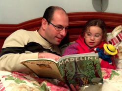
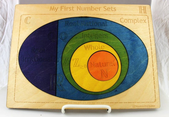
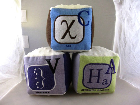
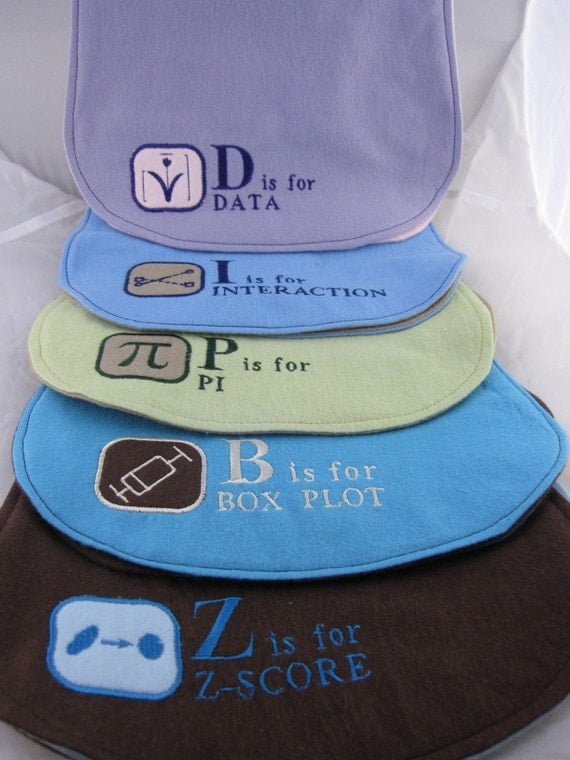
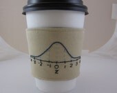
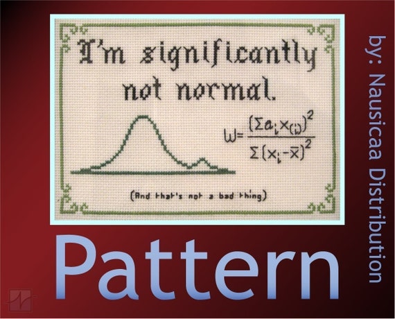
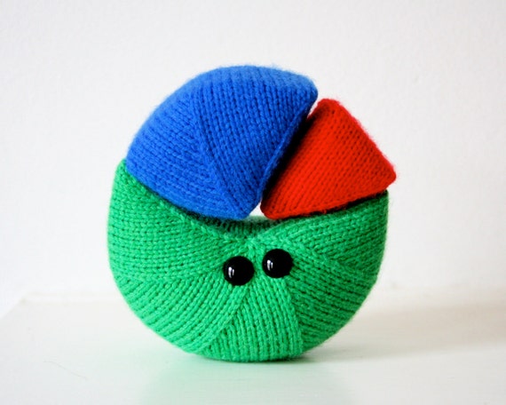
The 2014 Gift Guide for Geeks, Dorks, and Research Gurus
Well, it’s that time of year again!
Regardless of which holiday you celebrate and even if you celebrate the holiday of “I deserve a treat today”, you’re sure to find a statistics gift for yourself or your loved ones below. Just click on the image to go to the website and order. Go! Quickly before they run out! Shirts, cups, hats, toddler toys, and more, they’re all here.
If you come across other fun statistics and research gifts, leave a link in the comments for other folks. Enjoy!


Why do kids (and you) need to learn statistics?
Statistics are boring. They’re hard. They’re useless. You’ll never use them in real life.
 Oh, how wrong that is. I’ll agree that if you aren’t blessed with the genes that make math and statistics a piece of pie (mmmm, pie), then yes statistics are hard. But there are innumerable real-life examples to show just how important it is to be comfortable with statistics.
Sports: If you’re a fan of sports, you no doubt are bombarded with statistics throughout the season just like these interpretations of statistics shared by James Conley on the Pensburgh. The headlines are exciting but the reality of each headline is simple – they mislead and even outright lie. If you understood statistics, you’d immediately see for yourself what the numbers really said.
HEADLINE! Pittsburgh’s penalty kill is going to be an Achilles’ Heel this season!
(The team has killed 18 straight chances over its last five games.)
BREAKING! The team is going to walk away with the Metropolitan Division again!<
(They’re in second place, and half the division is within a point of catching them.)
THIS JUST IN! The Penguins just can’t put away teams late in the game!
(They’ve outscored their opponents 5-0 in the third period of two straight games, both wins.)
via On the Penguins, Sample Size and Apocalypse Narratives (Tuesday Slew) – PensBurgh.
Medicine: How many commercials on TV and ads in magazines extol the virtues of amazing new drugs, perhaps even drugs that you are desperate to try to alleviate your own health issues? If you understood statistics, you would know right away when the ads were misleading. You’d spot when the sample sizes were too small to be reliable, when the effect size was too small to be meaningful, or when the lack of a test-retest design suggested insufficient testing.
Sometimes companies egregiously exaggerate how well their drugs work. In a brochure given to doctors and nurses last year, the Japanese drug company Eisai claimed that its Dacogen drug helped 38% of patients with a rare blood cell disorder in a clinical study. This figure was false, the FDA said in a November 2009 warning letter. In fact, the figure was taken from a tiny subgroup of patients who responded well to the drug. When all patients in the study were included, the real response rate was a much less impressive 20%, the FDA noted.
Read more on this and other misleading advertisements here.
Politics: Political polling is becoming more and more prominent in the news. If you had a better understanding of statistics, you would know when to trust the polls. You would know why percentages don’t always add to 100, why polls ‘weight’ data, or why the margin of error is ridiculously important (even if you don’t have a random sample).
Seven hundred randomly selected New York likely voters were interviewed by landline and cell telephone between October 1 and November 1, 2014. The margin of sampling error is +/- 3.6 percent. The data have been weighted to adjust for numbers of adults and telephone lines within households, sex, age, and region. Due to rounding, percentages may not sum to 100%. Responder numbers in each demographic may not equal the total respondent number due to respondents choosing not to answer some questions.
No matter how you look at it, statistics are among the most important classes you can take. It’s in your best interest to sign up for a class now.
Related articles
- Data Tables: The scourge of falsely significant results #MRX (lovestats.wordpress.com)
- Proud to be a member of survey research #MRX (lovestats.wordpress.com)
Which of these statistical mistakes are you guilty of? #MRX
On the Minitab Blog, Carly Barry listed a number of common and basic statistics errors. Most readers would probably think, “I would never make those errors, I’m smarter than that.” But I suspect that if you took a minute and really thought about it, you’d have to confess you are guilty of at least one. You see, every day we are rushed to finish this report faster, that statistical analysis faster, or those tabulations faster, and in our attempts to get things done, errors slip in.
 Number 4 in Carly’s list really spoke to me. One of my pet peeves in marketing research is the overwhelming reliance on data tables. These reports are often hundreds of pages long and include crosstabs of every single variable in the survey crossed with every single demographic variable in the survey. Then, a t-test or chi-square is run for every cross, and carefully noted for which differences is statistically significant. Across thousands and thousands of tests, yes, a few hundred are statistically significant. That’s a lot of interesting differences to analyze. (Let’s just ignore the ridiculous error rates of this method.)
But tell me this, when was the last time you saw a report that incorporated effect sizes? When was the last time you saw a report that flagged the statistically significant differences ONLY if that difference was meaningful and large? No worries. I can tell you that answer. Never.
You see, pretty much anything can be statistically significant. By definition, 5% of differences are significant. Tests run with large samples are significant. Tests of tiny percents are significant. Are any of these meaningful? Oh, who has time to apply their brains and really think about whether a difference would result in a new marketing strategy. The p-value is all too often substituted for our brains. (Tweet that quote)
It’s time to redo those tables. Urgently.
Read an excerpt from Carly’s post here and then continue on to the full post with the link below.
Statistical Mistake 4: Not Distinguishing Between Statistical Significance and Practical Significance
It’s important to remember that using statistics, we can find a statistically significant difference that has no discernible effect in the “real world.” In other words, just because a difference exists doesn’t make the difference important. And you can waste a lot of time and money trying to “correct” a statistically significant difference that doesn’t matter.
via Common Statistical Mistakes You Should Avoid.
Related articles
- Are There Perils in Changing the Way We Sample our Respondents by Inna Burdein #CASRO #MRX (lovestats.wordpress.com)
- 11 signs that you don’t have a research objective #MRX (lovestats.wordpress.com)
- Do Google Surveys use Probability Sampling? #MRX #MRMW (lovestats.wordpress.com)
13 tips for giving the worst presentation ever
It’s possible that I’ve attended too many conferences in the last few years as I have witnessed more terrible presentations than I would have ever wanted. If you are eager to make it to the top of my WORST PRESENTATION EVER list, here are a few tips to follow.
- Dress to impress. Pick out your crappiest jeans and throw on a wrinkled shirt. This will show everyone that you’re far too important to care how you look at such an inconsequential event like this.
 Do a sound check as soon as you step on stage to begin your talk. This is necessary because the sound team generally forgets to monitor the sound of speakers and they need you to remind them.
- Stand directly behind the podium with your hands firmly clasped to the edge. This way, you will appear in complete control of the podium. Your power and importance will be obvious. And, you will be perfectly positioned with your face hidden behind the microphone .
- Read your speech. Everyone knows that grammar is important. By reading your speech, you will be assured that no one can judge you for misusing a verb tense or uttering an incomplete sentence. Grammar nazis are everywhere.
- Mention your company name not once, not twice, but at least 20 times. People won’t know which company to rush over to and shake their money at if you don’t remind them every 30 seconds. Say things like, “At Company A, we believe that…” and “We used our own high quality research panel, Panel Awesomeness, to conduct this research.”

- Reference your work with as many important people and companies you can. Some people call this name dropping but they’re just jealous. They know that it’s proof you are highly skilled. Specifically, mention a project you plan to conduct with Stan or Diane or Pinterest or Apple. Be sure to refer to people casually so we think you are personal friends with them, and not just picked out from the article you read this morning.
- Use a laser pointer to highlight points that should have been obvious without a laser pointer. Because lasers are cool.
- Let people know that you aren’t good with numbers and your data guy can get back to them if need be. It’s good to show you understand your own weaknesses especially if you don’t want to bother to improve them.
 Be sure to choose good colours in your prezzie. Focus on complementary colours such as red font on green background or yellow font on blue background. They aren’t called complementary for nothing!
- Make sure to use 12 point font. Anyone who can’t read your prezzie from the back of the conference room is just too stupid to move to the front of the room and doesn’t deserve to read it anyways.
- Put equations on every page. It makes you look really smart so it doesn’t matter if people can’t read them due to fonts and layout.
- Don’t show any data. People aren’t concerned with details and they’ll believe everything you say anyways. Besides, numbers are hard to understand. [Insert whiny voice here.]
 Put clip art on every page. It doesn’t matter if you couldn’t find a picture that actually demonstrated the point. People love pictures!

Related articles
- How women should ask for a raise if they don’t want to follow Microsoft’s CEO advice of Trust Karma (lovestats.wordpress.com)
- Interesting infographic: How your brain sees a logo (lovestats.wordpress.com)
- Missing Data: Whose problem is it anyways? (web.peanutlabs.com)